Contents
Basics
Selector: the HTML tags that receive the style
Declaration: the style sheet properties and their values
body {background:black}
selector {declaration:declaration value}
Comments
Use for single and multi-line comments.
/* Comment here */
Set Font Size With Em
To avoid the resizing problem with Internet Explorer, many developers use em instead of pixels. The em size unit is recommended by the W3C. 1em is equal to the current font size. The default text size in browsers is 16px. So, the default size of 1em is 16px. The size can be calculated from pixels to em using this formula: pixels/16=em
h1 {font-size:2.5em;} /* 40px/16 = 2.5em */
h2 {font-size:1.875em;} /* 30px/16 = 1.875em */
p {font-size:0.875em;} /* 14px/16 = 0.875em */
Formatting <hr/>
When formatting horizontal rule, additional declarations need to be added to ensure compatibility across all browsers:
hr {
color:rgb(192,192,192); /* change color in IE */
background-color:rgb(192,192,192); /* change color in mozilla */
border:none; /* remove border if changing color */
/* center alignment */
text-align:center; margin: 0 auto;
/* right alignment */
text-align:right; margin: 0 0 0 auto;
/* left alignment */
text-align:left; margin: 0 auto 0 0;
height:2px;
margin-top:15px;
margin-left:146px;
width:583px;
}
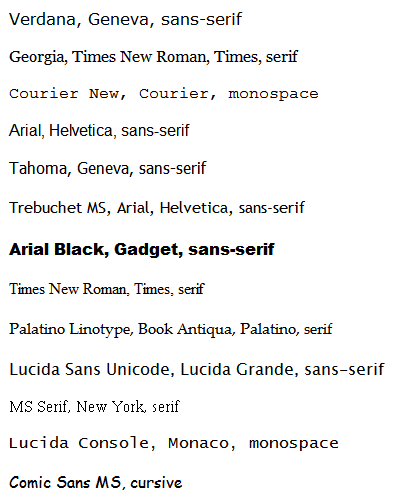
Font Families
The font-family property should hold several font names as a fallback system. If the browser does not support the first font, it tries the next font.
Verdana, Geneva, sans-serif
Georgia, Times New Roman, Times, serif
Courier New, Courier, monospace
Arial, Helvetica, sans-serif
Tahoma, Geneva, sans-serif
Trebuchet MS, Arial, Helvetica, sans-serif
Arial Black, Gadget, sans-serif
Times New Roman, Times, serif
Palatino Linotype, Book Antiqua, Palatino, serif
Lucida Sans Unicode, Lucida Grande, sans-serif
MS Serif, New York, serif
Lucida Console, Monaco, monospace
Comic Sans MS, cursive
Inline, Embedded & Linked Styles
Cascading Precedence
Web browsers give prcedence to the styles that appear closest to the tag. Precedence is in this order:
1. Inline
2. Embedded
3. Linked
Inline Styles
Use to add style properties to HTML tags as the tag is entered.
<p style="margin-left:10px; margin-right:10px;">my text here</p>
Embedding CSS into an HTML file
CSS can be embedded into the header tags of your HTML file:
<html>
<head>
<style type="text/css"> <!–– Define your styles here ––>
h1 {color:red;} <!–– anytime an h1 tag is seen, color will be red ––>
.blue {color:blue}
.master{font-family:verdana;color:blue;font-size:10px;} <!–– font size can be defined by percentage, pixels, inches, point, etc ––>
.master2{font-family:verdana; color:white; font-size:10px; background-color:#1f3449; text-decoration:underline; font-weight: bold; font-style: italic;}
</style>
</Head>
<body>
<h1>Red text, heading 1</h1>
<span class=blue>Blue text only</span>
<br><h3 class=blue>Blue text, heading 3</h3>
<span class=master>Text with font, color, and size defined</span>
<br><span class=master2> Text with font, color, background, bold, underline, italic, and size defined </span>
</body>
</html>
Linking HTML to an external CSS file
Use this technique to link HTML to a style sheet saved in a different location. This is useful in applying a style to an entire web-site:
<html>
<Head>
<link rel="stylesheet" type="text/css" href="CSS_External.css" />
</head>
<body>
<h1>Red text, heading 1</h1>
<span class=blue>Blue text only</span>
<br><h3 class=blue>Blue text, heading 3</h3>
<span class=master>Text with font, color, and size defined</span>
<span class=master2><b> Text with font, color, background and size defined </b></span>
</body>
</html>
*Note that for the above code to work, the code below must be saved without HTML tags in a separate .css file:
h1 {color:red}
.blue {color:blue}
.master{font-family:verdana;color:blue;font-size:10px;}
.master2{font-family:verdana;color:white;font-size:10px;background-color:#1f3449}
ID & Class Selectors
ID Selector
- WC3 standards specify that any given ID name can only be referenced once within a page or document. IDs are most commonly used correctly in CSS layouts. For example, there is usually only one menu per page, one banner, or one content pane.
- You can apply a selector to a specific HTML element by simply stating the HTML selector first, so
p.jam {color:red;}will only be applied to paragraph elements that have the class 'jam'. - Classes have no special abilities in the browser, but ID's do have one very important trick up their sleeve. This is the "hash value" in the URL. If you have a URL like
http://yourdomain.com#comments, the browser will attempt to locate the element with an ID of "comments" and will automatically scroll the page to show that element.
#top {background-color: #ccc; padding: 1em}
<div id="top">
Class Selector
Use classes when there are one or more occurrences per page. Regarding CSS, there is nothing you can do with an ID that you can't do with a Class and vise versa. More info: http://css-tricks.com/the-difference-between-id-and-class/
.intro {color: red; font-weight: bold;}
<p class="intro">
Tableless Design
Tableless Design (Box Model)
Tables are designed for presenting tabular data suck as numbers or statistics, not for presentation of layouts. Tableless design is possible using <div> tags which are a highly adaptive block-element tag used for creating flexible layouts.
<style type="text/css">
/* centering cheat; separate from other body declarations */
body {
text-align: center;
}
#container {
width: 1000px;
text-align: left;
margin: 0px auto;
}
#header {
float: left;
width: 1000px;
height: 60px;
}
#sidebar {
float: left;
width: 175px;
height: 500px;
margin-top: 10px;
margin-bottom: 10px;
}
#content {
float: right;
width: 825px;
height: 500px;
}
#footer {
float: left;
width: 1000px;
clear: both;
}
</style>
<body>
<div id="container">
<div id="header"> <!–– header here ––> </div>
<div id="sidebar"> <!–– sidebar here ––> </div>
<div id="content"> <!–– content here ––> </div>
<div id="footer"> <!–– footer here ––> </div>
</div>
</body>
Overlapping Images (Tableless Design)
Use this method to overlap images in a tableless CSS site.
/* use the text-align attribute for IE compatibility. */
body {text-align: left;}
/* set container position to relative. */
#container {position: relative; width: 900px; margin:0 auto;}
/* set position for each embedded <div> to absolute. */
#front-img {position: absolute; float: left; margin-top: 5px; margin-left: 5px; z-index: 2;}
/* use z-index to indicate order. Larger numbers are brought to front, smaller to back. */
#back-img {position: absolute; float: left; margin-top: 5px; margin-left: 5px; z-index: 1;}
Conditional Style Sheets
Browser Detection
Use the code below to create conditional stylesheets. The approach below will use one .css file for IE browsers and another .css file for non-IE browsers. This technique is sanctioned by Microsoft and is a better alternative than hacks since their behavior is more predictable for future browser releases.
<head>
<!––[if IE]><link rel="stylesheet" type="text/css" href="styles_IE.css" /><![endif]––>
<!––[if !IE]><!––><link rel="stylesheet" type="text/css" href="styles.css" /><!––<![endif]––>
</head>
Media Types
CSS Media Types Printer Friendly Style Sheets
Different CSS media types are available for displaying output to different medias such as print preview, handheld, or projector. For example, use one external style sheet for your site's navigation, and use a second style sheet for users who print your site. More info available here: http://www.javascriptkit.com/dhtmltutors/cssmedia.shtml
<!–– use 2 stylesheets: one for viewing the site, and one for printing site contents ––>
<link rel="stylesheet" type="text/css" media="print" href="print.css">
<!–– below will print black text, white background, remove top banner, remove left nav, ––>
<!–– and expand the main content area to 100% of the page's width ––>
<style type="text/css">
@media print {
body {background-color:#FFFFFF; background-image:none; color:#000000}
#ad {display:none;}
#leftbar {display:none;}
#contentarea {width:100%;}
}
</style>
Jerry's Custom Code
Includes a custom class that can be used on multiple selectors as well as an option to print landscape orientation on legal size paper.
@media print {
.hidden {display:none;}
@page {size:legal landscape;}
}
Media Queries
Media queries can be added to a web page to use different stylesheets based on the type of device used to access the page.
<!–– iPad portrait ––>
<link href="css/ipadP.css" rel="stylesheet" media="only screen and (min-device-width: 768px) and (max-device-width: 1024px) and (orientation: portrait)">
<!–– iPad landscape ––>
<link href="css/ipadL.css" rel="stylesheet" media="only screen and (min-device-width: 768px) and (max-device-width: 1024px) and (orientation: landscape)">
<!–– iPhone portrait ––>
<link href="css/iphoneP.css" rel="stylesheet" media="only screen and (min-device-width: 320px) and (max-device-width: 480px) and (orientation: portrait)">
<!–– iPhone landscape ––>
<link href="css/iphoneL.css" rel="stylesheet" media="only screen and (min-device-width: 320px) and (max-device-width: 480px) and (orientation: landscape)",>
Expanding Menu
Expandable menu with CSS and JavaScript:
- Free Menu Creator: http://css3menu.com/
- 13 JavaScript / CSS Menus: http://www.noupe.com/css/13-awesome-java-script-css-menu.html
Shorthand Properties
Margin
The margin property can have from one to four values:
margin:25px 50px 75px 100px;
top margin is 25px
right margin is 50px
bottom margin is 75px
left margin is 100px
margin:25px 50px 75px;
top margin is 25px
right and left margins are 50px
bottom margin is 75px
margin:25px 50px;
top and bottom margins are 25px
right and left margins are 50px
margin:25px;
all four margins are 25px
Miscellaneous
Hyperlinks
Use the following code to designate the color for links. Different attributes can be set for the link itself, whether the link was visited, hovered over, etc.
/* When the <a href> tag is detected, the CSS above will be applied. */
a:link, a:visited, a:active {color:blue; text-decoration:none;}
a:hover {text-decoration:underline; color:black;}
/* To create multiple link schemes, first create a custom CSS class: */
a.topmenu:link, a.topmenu:visited, a.topmenu:active {font-family:arial; color:#336699;}
a.topmenu:hover {text-decoration:underline; color:#CCCCCC;}
/* Next, reference the class in your HTML file: */
<a href="index.php" class="topmenu">Home</a>
Remove Blank Line in Lists
ul {margin-top:0px; margin-bottom:0px;}
Line Height
Use line height to create double spaced text.
body {line-height: 25px;}
Center Text
body {text-align: center;}
Center an Image with Inline Styles
Use this as an alternative to the html <align="center"> tag.
<div style="text-align: center;">
<img src="images/art.jpg" alt="" border="">
</div>
Background Image and Color
body {
background-color: #050402;
background-image:url('image.png');
background-position: top;
background-repeat: no-repeat;
}
Center <div> Box
To center a div box, avoid using align:center, which only aligns the elements inside the div box and not the div box itself.
<!–– to center div box in all browsers except IE: ––>
#container {
margin:0 auto;
}
<!–– to center div box in IE: ––>
body {
text-align: center;
}
Table and Cell Borders
If applying a border to the top and bottom (or left of right) of adjacent cells, then use the border-collapse declaration to collapse the shared border. This will prevent borders from appearing twice as thick as they should be.
td {
border-top: 1px solid #ACA899;
border-bottom: 1px solid #ACA899;
border-collapse:collapse;
}
Create an Input Button Using an Image
An image can be used either behind or in lieu of the text of a button:
/* CSS: */
.calendar-button {
background:url(/images/calendar.gif) no-repeat;
cursor:pointer;
width:16px;
height:17px;
border:none;
}
<!–– HTML ––>
<input type="button" class="calendar-button">
Hiding an Element
Hiding an element can be done by setting the display property to none or the visibility property to hidden.
visibility:hidden hides an element, but it will still take up the same space as before. The element will be hidden, but still affect the layout.
h1 {visibility:hidden;}
display:none hides an element, and it will not take up any space. The element will be hidden, and the page will be displayed as the element is not there.
h1 {display:none;}
RGB Color Values
Color values can be selected using color codes or RGB values.
rgb(255,255,255);
Full Page Background Image
On option is to use an inline <img> element to resize to any browser. Compatible with all browsers and IE6+. More info here.
<style type="text/css">
img.bg {
/* Set rules to fill background */
min-height: 100%;
min-width: 1024px;
/* Set up proportionate scaling */
width: 100%;
height: auto;
/* Set up positioning */
position: fixed;
top: 0;
left: 0;
}
@media screen and (max-width: 1024px) { /* Specific to this particular image */
img.bg {
left: 50%;
margin-left: -512px; /* 50% */
}
}
</style>
<body>
<img class="bg" src=""images/background.jpg" alt="">
</body>
Stretch Background Image
Use the attribute below to scale the background image to be as large as possible so that the background area is completely covered by the background image. Some parts of the background image may not be in view within the background positioning area.
background-size:cover;
List Style Type Property
CSS offers the flexibility to format bullet points. More info here.
ul.square {list-style-type:square}
<ul class="square">
<li>first one</li>
</ul>
!important
The !important rule overrides a css property.
p {
color: red !important;
}
#thing {
color: green;
}
<p id="thing">This text will appear RED.</p>
My CSS Menu Generator
www.mycssmenu.com is a web-based menu generator used to create css based drop down menus. Follow these tips to create a compact, browser agnostic menu:
- Use pure CSS (no JavaScript). To select, go to:
Settings > HTML Structure - Use classic ul/li structure. To select go to:
Settings > HTML Structure - Select add-on to allow menu to overlap IE drop down menus. To select, go to:
Ad-Ons > Select Tag Fix IE - To access quick color edits, go to:
Settings > Quick Color Edits - To save file:
File > Custom Publish
CSS Stylesheet: External
Menu Code / Add-Ons: external
Menu Structure: In Page (setup as server include)
HTML Structure: Pure CSS - If rebuilding from scratch, use
File > Importto import existing ul/li structure - Do NOT use
File > Save. This creates an XHTML 1.0 Strict file intended to be used as a new working file, and not something to embed into an existing web page.
CSS3
Rounded Corners
Adding rounded corners in CSS2 was tricky. Different images were required for each corner. In CSS3, the border-radius property is used to create rounded corners:
div {
border:2px solid;
border-radius:25px;
-moz-border-radius:25px; /* Firefox 3.6 and earlier */
}
Wide Blocks
Some mobile browsers (including Safari for iOS, Chrome for Android, Mobile Firefox, and IE mobile) increase the font size of wide blocks so that if a user double-taps to zoom in on that block (which fits the block to the screen width), the text will be legible. To override this behavior, apply the following to the body or div selector:
-webkit-text-size-adjust:100%;